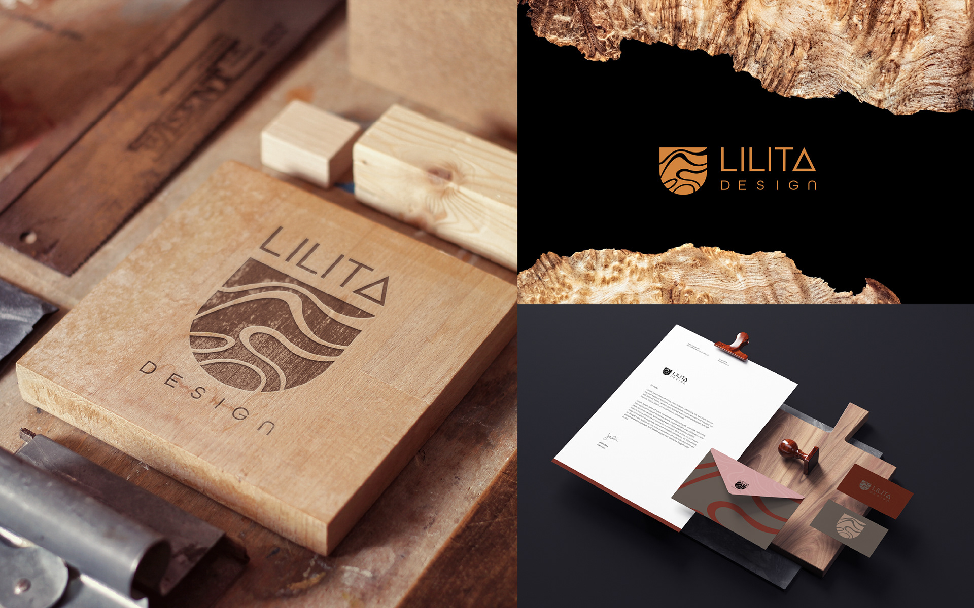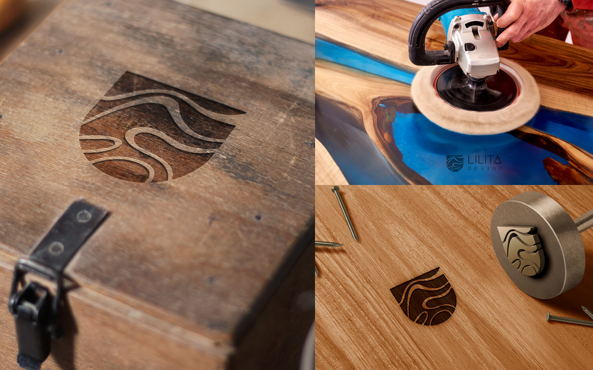
An exciting rebranding project was undertaken involving the fabulous art portfolio of the talented Lilita Design. Working closely with Lilita, we successfully identified the key stages of brand development and constructed the visual elements that shaped this proposal.
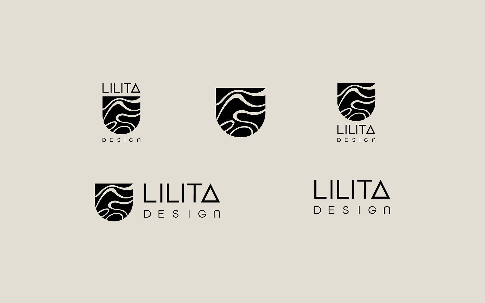
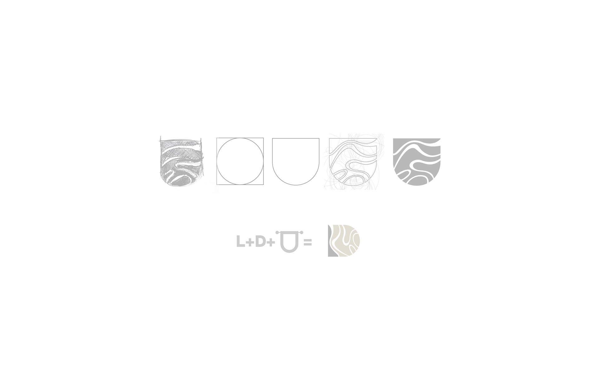
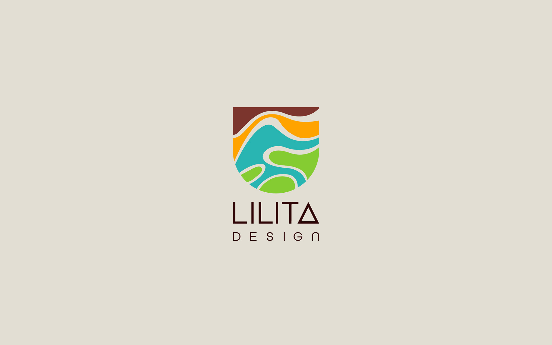
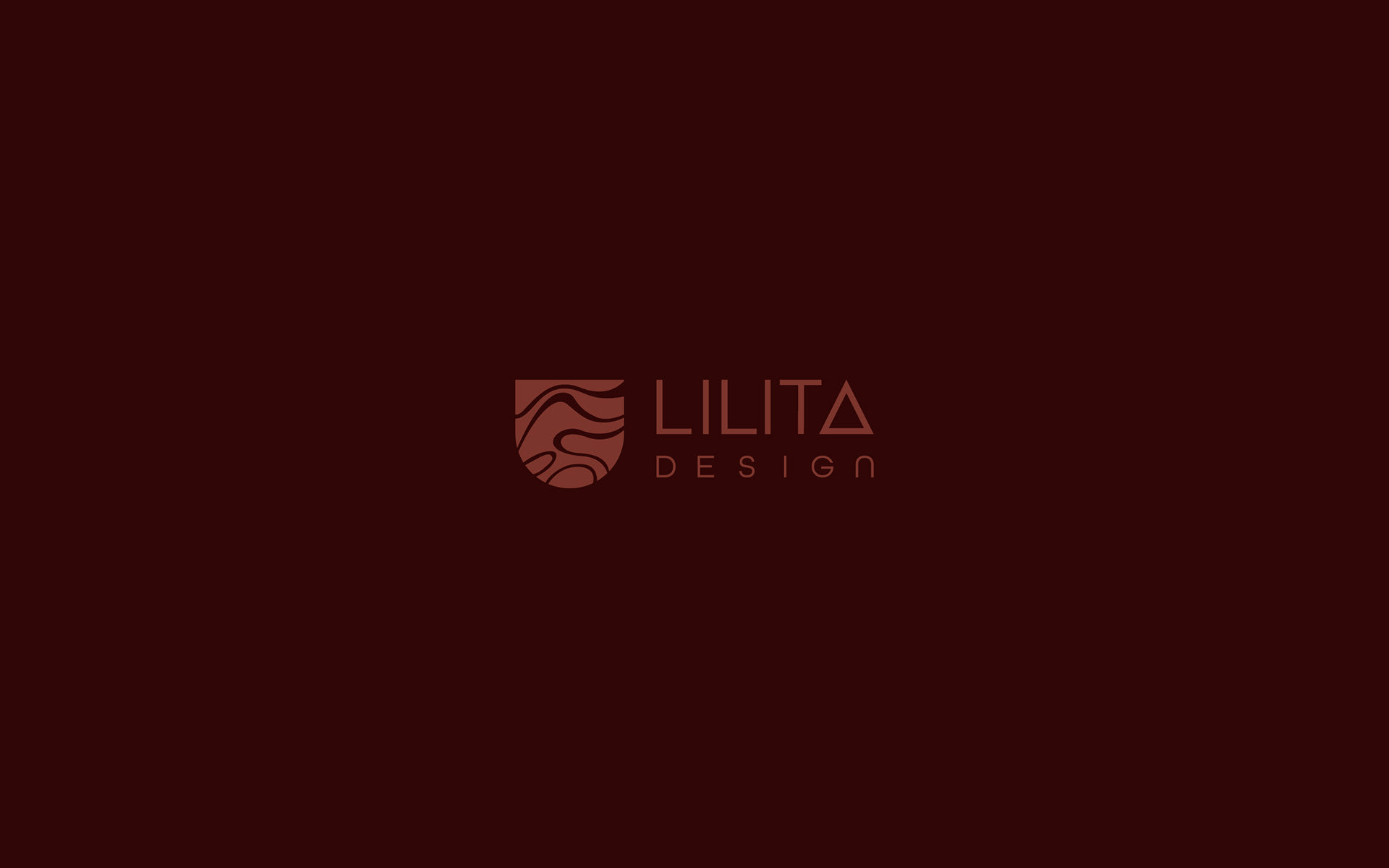
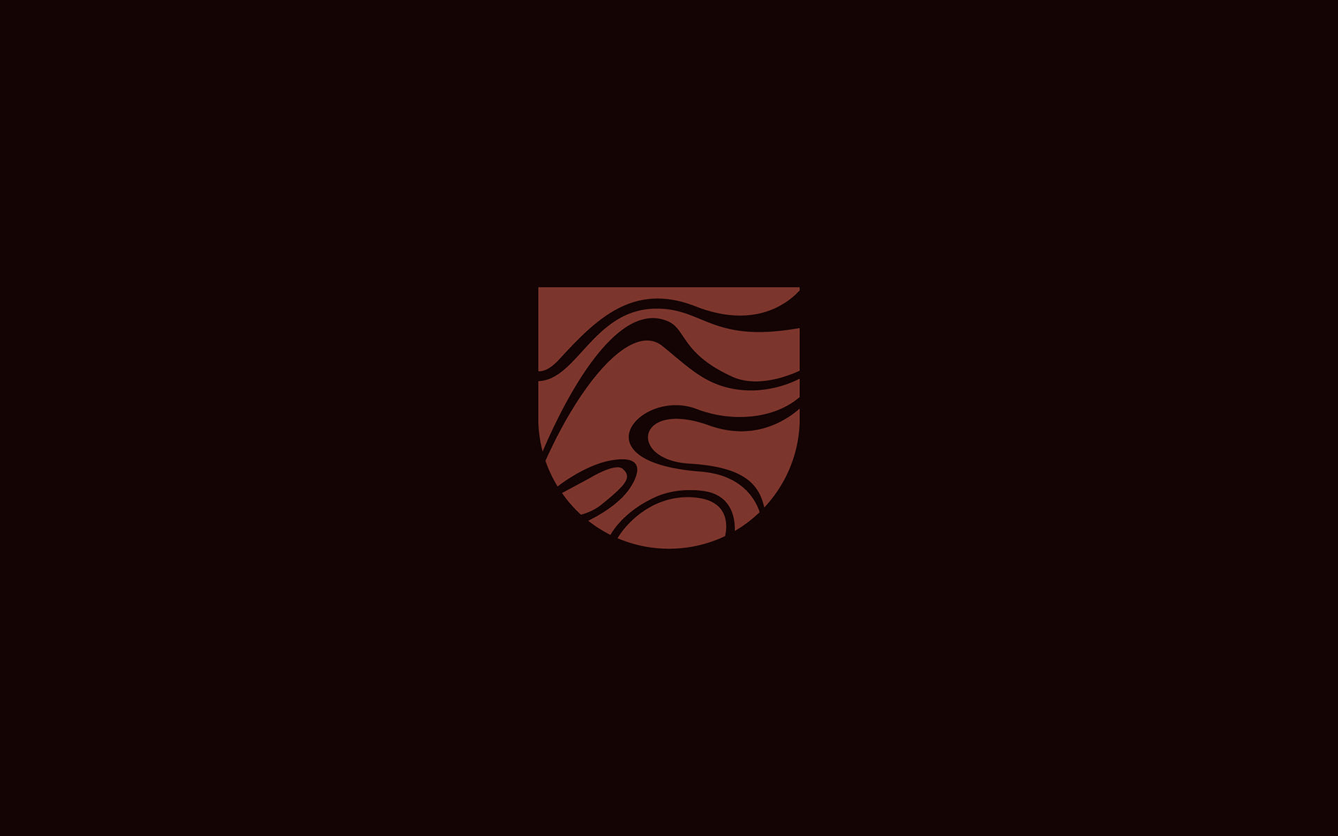
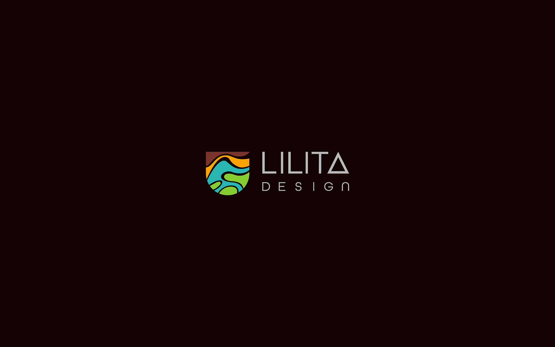
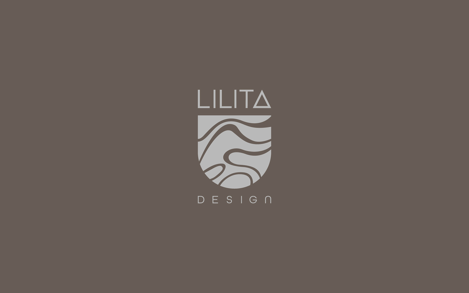
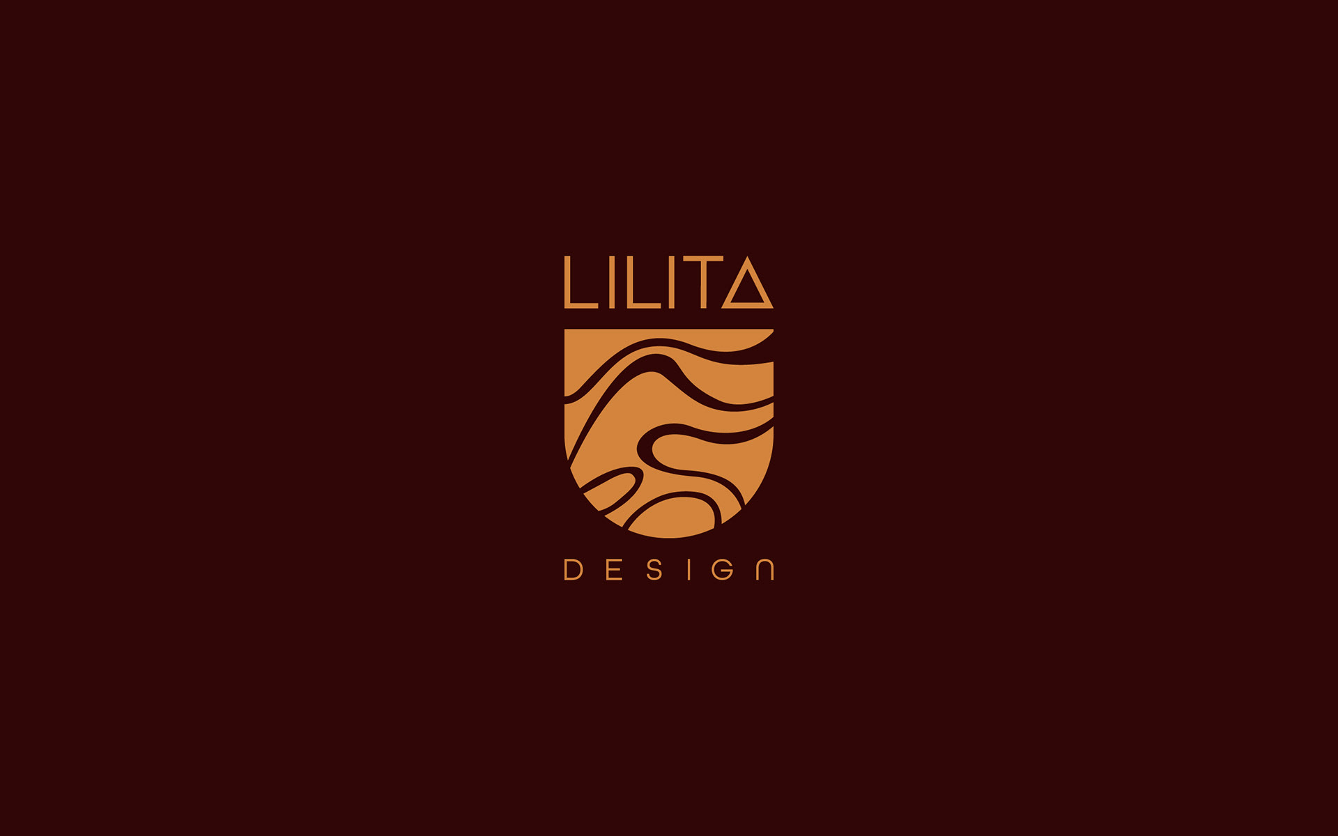
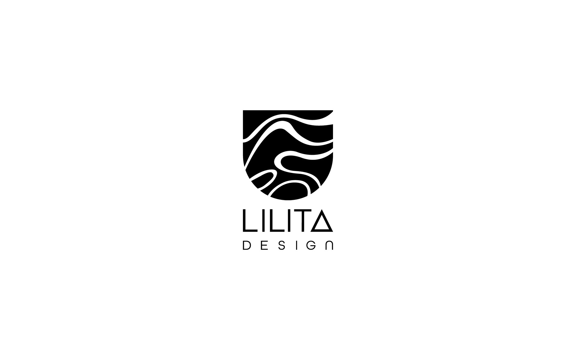
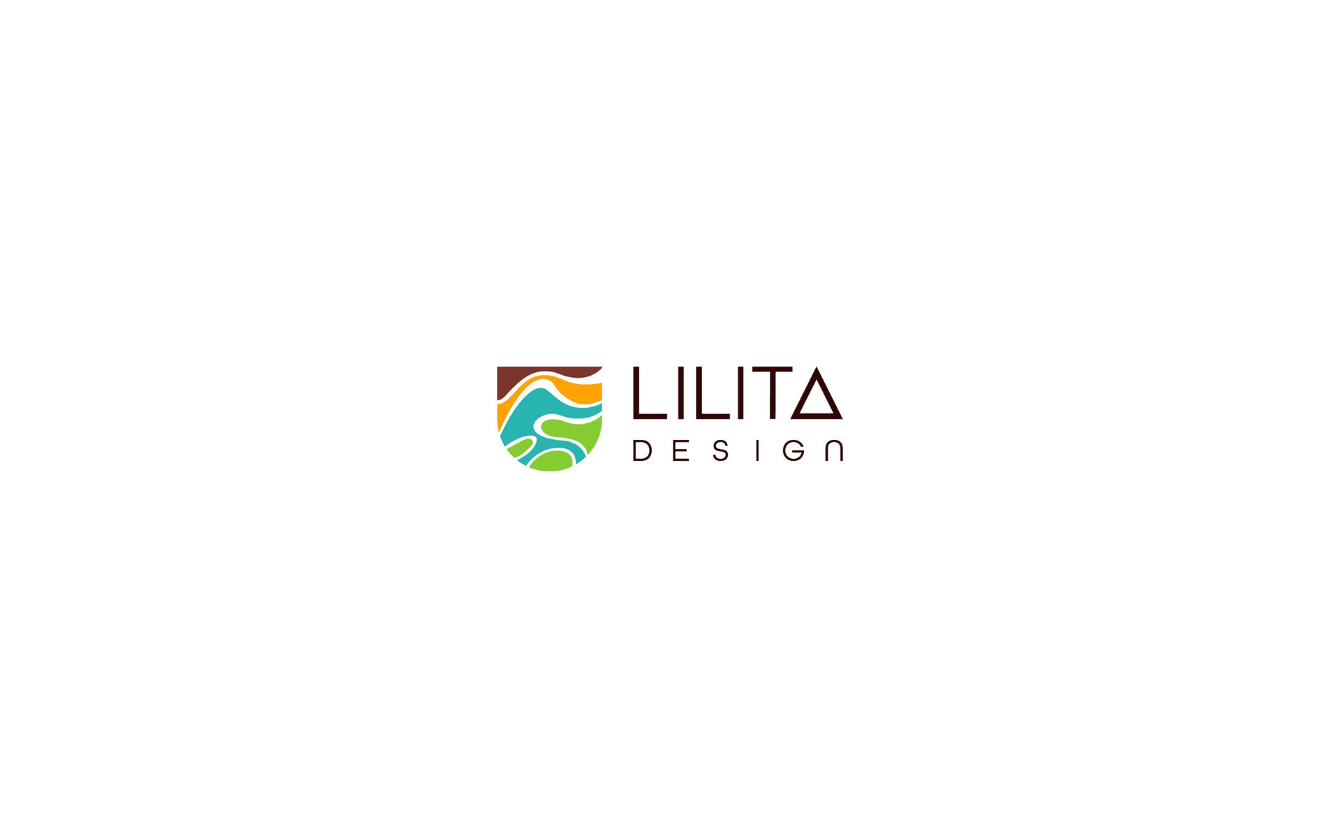
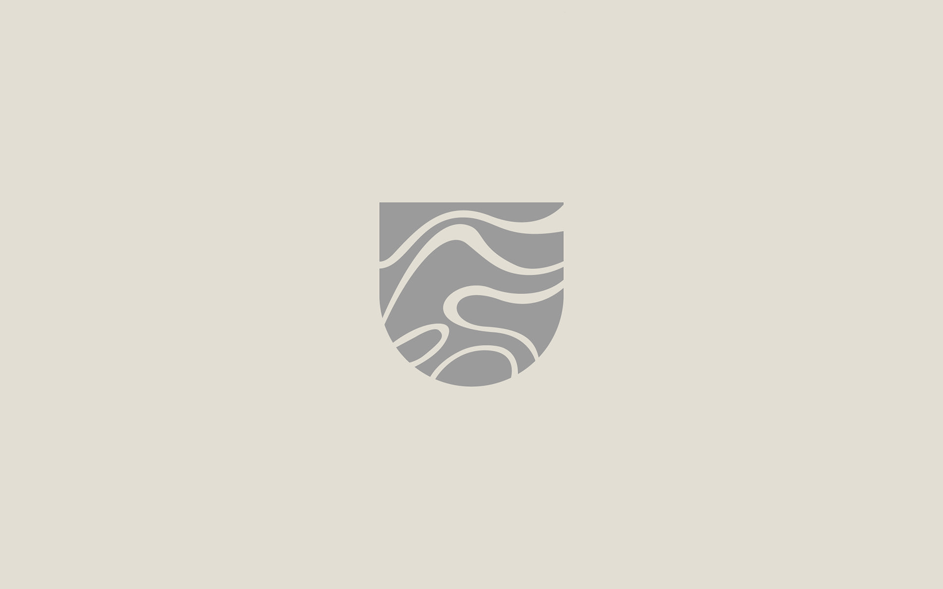
At the core of the new design is the logo, which organically and vividly represents the elements of nature that Lilita incorporates into her artworks. This graphical element conveys the essence and focus of her work, emphasizing her commitment to the recovery, transformation, and rejuvenation of natural elements. The combination of shapes and textures in the logo creates a sense of movement and energy, reflecting the passion and dedication Lilita pours into each of her handmade pieces.
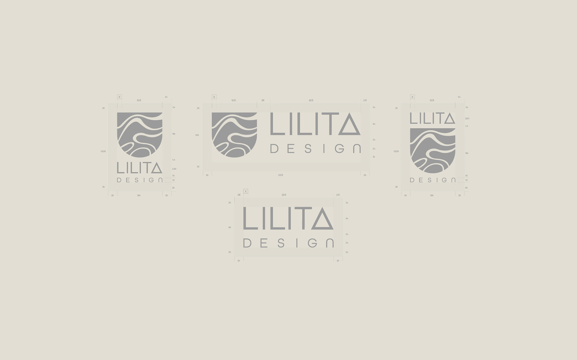
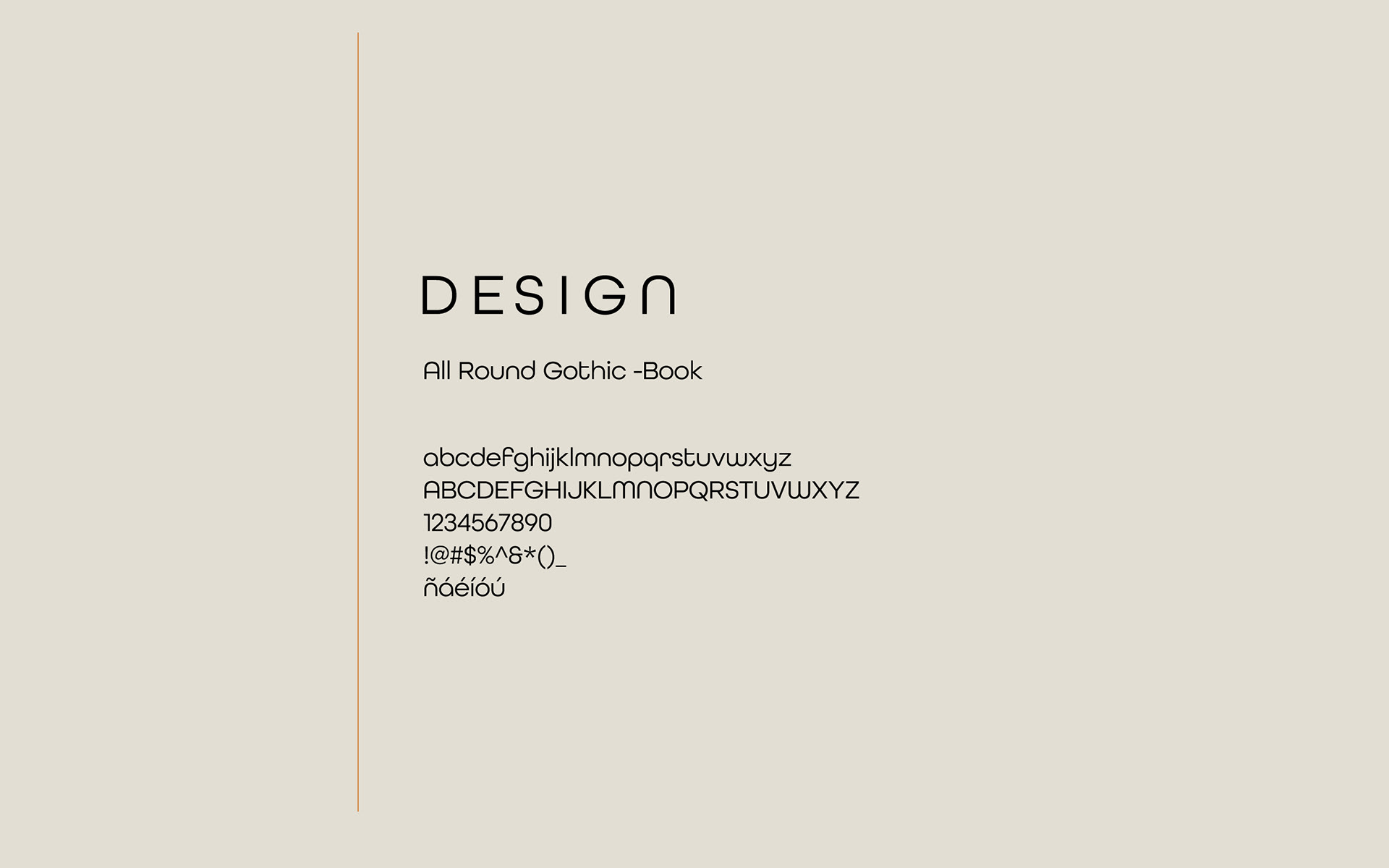
The typographic construction of the brand was custom-made, with special emphasis on the letter "A," which forms a triangle. This triangle represents stability and perfection, symbolizing the brand's continuous evolution and growth. Additionally, the letters "L" and "D" are subtly and subjectively incorporated, elevating the name of Lilita Design and transforming it into a banner that represents the effort and passion invested in each creation.
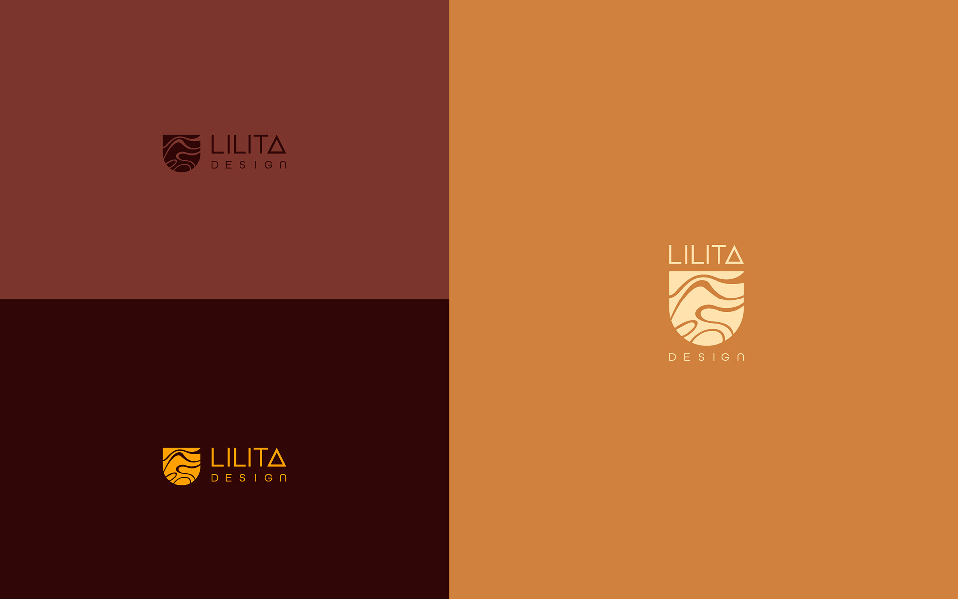
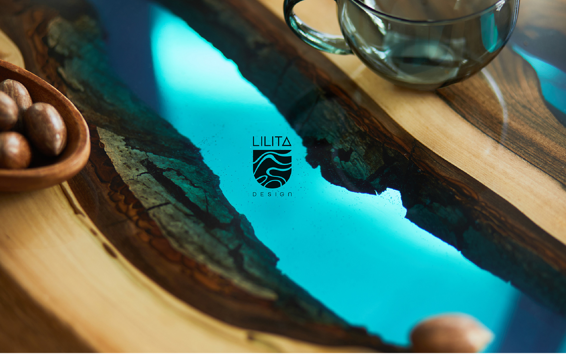
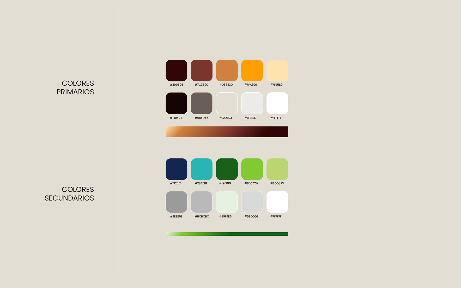
The color palette selected for the design is based on tones that evoke nature, such as wood, earth, fire, water, and nature itself. These colors directly associate with the experience that Lilita aims to convey through her art, capturing the beauty and harmony of nature in each of her creations.
In summary, the rebranding project of Lilita Design was an exciting journey that successfully captured the brand's essence and values. Through an organic and vibrant logo, a customized typographic construction, and a nature-inspired color palette, a distinctive and cohesive visual identity was created. This new design reflects Lilita's passion for her work and conveys the message of respect and connection with nature that remains at the core of each of her artworks.